Our
Client
Surrey & White Rock Board of Trade
Industries
Economic Development
Government & Community
Business Associations
Non-Profit Organizations
Link
Services
Brand Strategy
Logo Design
Visual Identity System
Print & Digital Collateral
Signage & Environmental Design
Social Media Design
Copywriting
Brand Voice
A complete rebrand merging two established organizations into one unified, future-focused voice for business.
For decades, the Surrey Board of Trade and the South Surrey & White Rock Chamber of Commerce each served their own vibrant communities—advocating for business, championing local growth, and building deep relationships with the companies that power the region.
When the two organizations united to form the Surrey & White Rock Board of Trade, they knew this merger required more than a new name. It needed a brand that honoured both legacies, captured the strengths of each, and reassured members that the new organization would be stronger, more connected, and more impactful than ever.
Studiothink was brought in to create a full rebrand that would bridge both histories and set the tone for a bold, modern, unified future. Grounded in deep strategy, audience insight, and regional understanding, we developed a brand that is confident, human, community-focused, and built to stand as the voice of business for one of the fastest-growing regions in BC.
The problem
Merging two established organizations meant navigating legacy, identity, and expectation. Members of both groups had long-standing loyalties, differing perceptions, and concerns about what the merger meant for their services, networking opportunities, and representation.
Key challenges included:
- Blending two recognizable brands without alienating existing members
- Addressing concerns about organizational structure and continuity
- Reassuring long-time members who feared losing their identity
- Presenting a clear, unified voice for a region with diverse business needs
- Overcoming perceptions that one organization felt more corporate, while the other felt more grassroots
- Creating clarity and excitement around the merger rather than confusion
This rebrand needed to unify—not divide—and create a sense of shared purpose across Surrey and White Rock.

The solution
Studiothink developed a comprehensive brand strategy and a full identity system that reflected the combined strengths of advocacy, community, and business support across both regions.
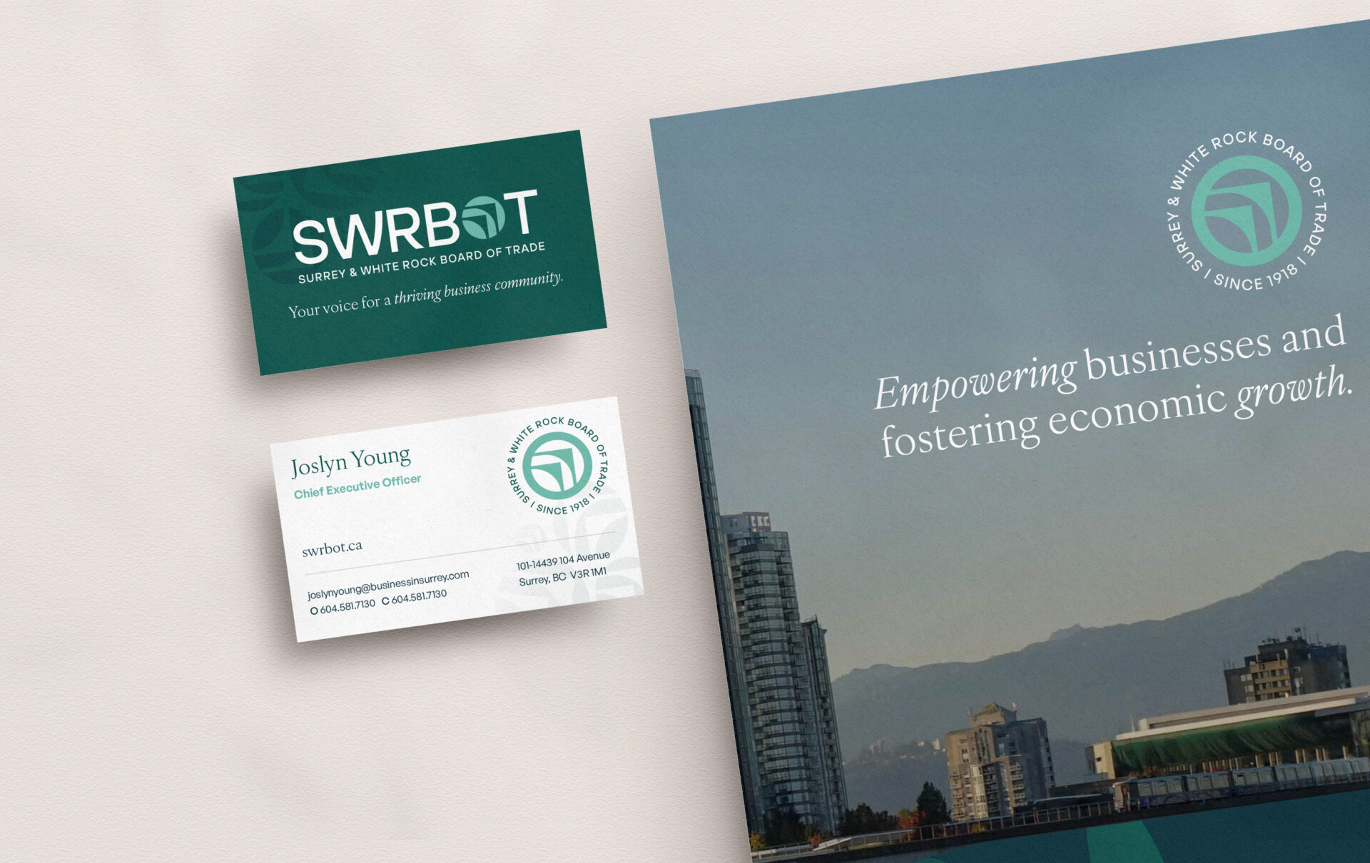
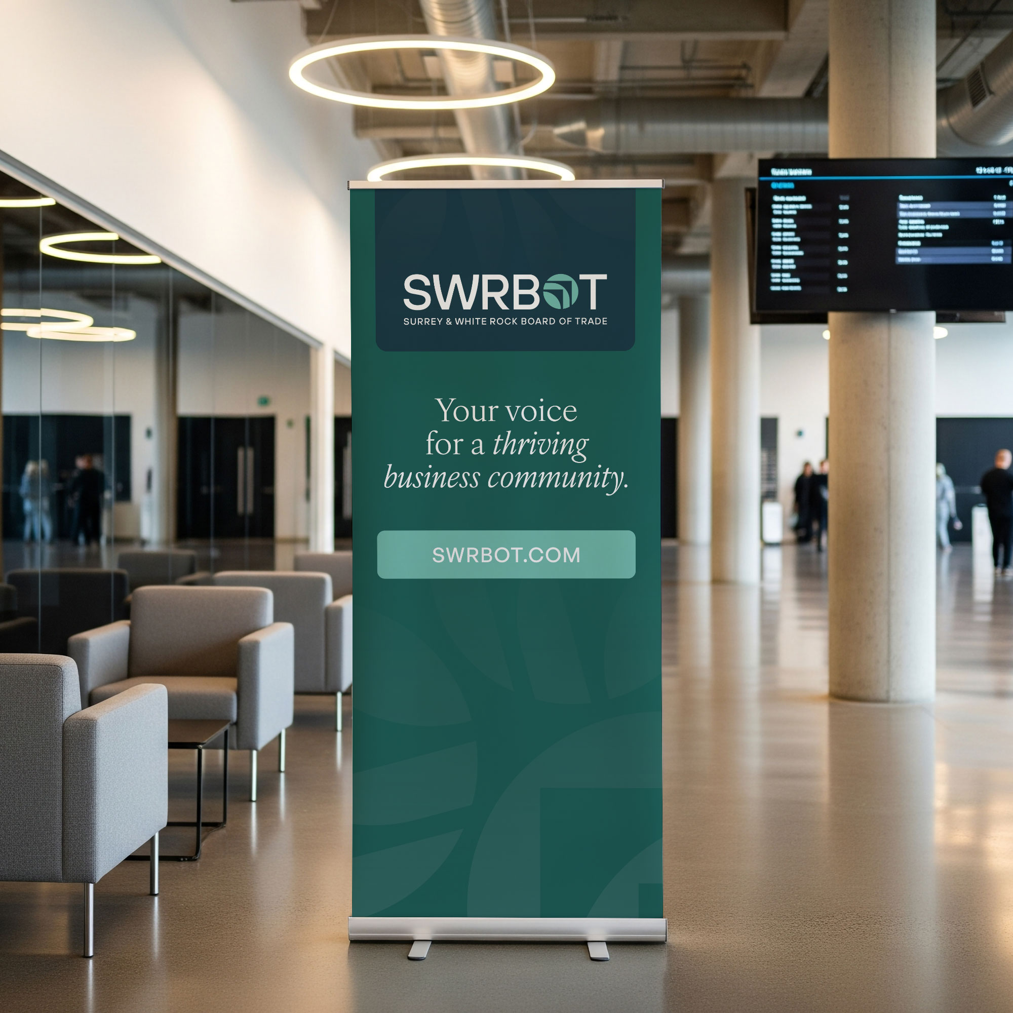
We created a new logo representing unity, leadership, and forward momentum, symbolic of two powerful organizations coming together to champion business in a rapidly growing region. The visual identity was built to be bold, modern, and accessible, with colours and typography that signal strength, collaboration, and inclusivity.
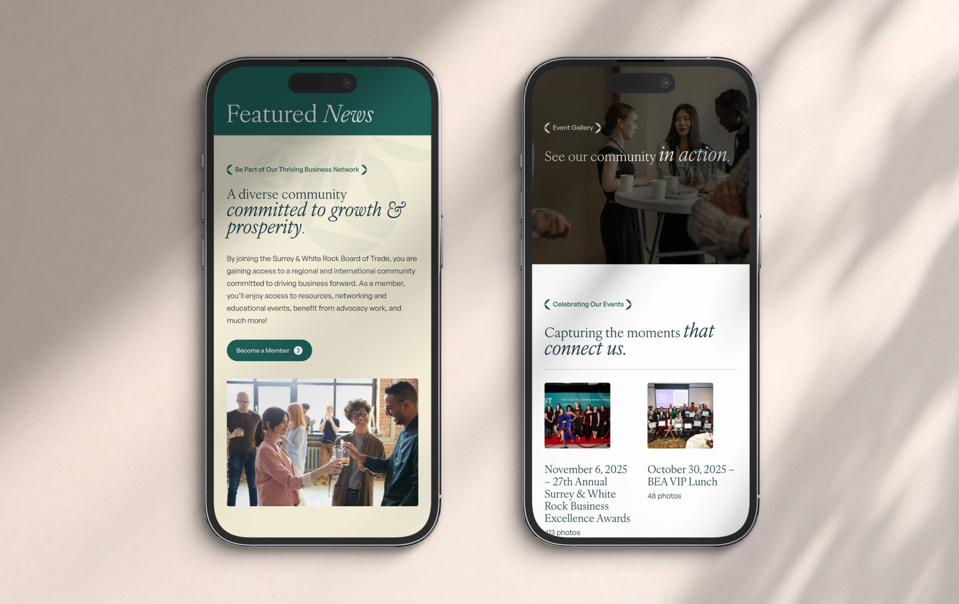
To support the transition, our team designed an extensive suite of branded materials, including:
- Stationery (business cards, letterhead, email signatures)
- Environmental signage
- Social media graphics and templates
- Event materials and name badges
- Member communications
- Presentation decks
- Digital assets for launch and ongoing use
Every touchpoint was crafted to embody the new voice: a steadfast advocate, an approachable leader, and an authentic partner. The result is a brand that unifies two legacies into one powerful, community-driven identity ready to represent businesses of all sizes, from startups to major institutions.